Using charts in Microsoft Word 2013 has become lot much easier than in earlier versions. Charts and graphs in Word 2013 has improved in visualizing the data in different patterns and shapes. Word 2013 have different type of charts available.
They are,
To do so,
Step 1: Open Word 2013.
Step 2: Choose a Blank Template to proceed.
Step 3: Go to Insert tab and click on Chart.
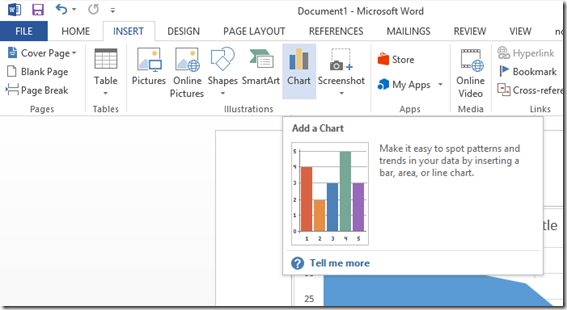
Step 4: Choose a type of chart that suits your requirement well and hit OK.
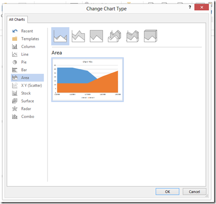
Now you have inserted the chart into the document, it’s time to customize the values in it.
If you chose to change them later, you can do it by right clicking on the chart and selecting Edit Data option.
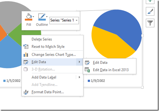
You can also edit the data values in Excel 2013 if you have huge data.
Let’s change the values of the pie chart you are seeing in this article. The following are the sample values given. When we change them from,
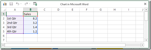
to

The pie chart will transform from this,
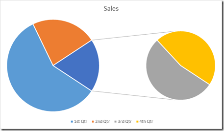
to
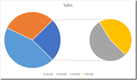
This is how we choose, insert and customize a chart in Microsoft Word 2013.
They are,
- Column charts
- Line charts
- Pie charts
- Bar charts
- Area plotting charts
- X Y (Scatter) charts
- Stock charts
- Surface charts
- Radar charts and
- Combo of any two charts
Choosing & Inserting a chart into document
In order to insert a chart in your document, you need to choose it first among the above told types.To do so,
Step 1: Open Word 2013.
Step 2: Choose a Blank Template to proceed.
Step 3: Go to Insert tab and click on Chart.

Step 4: Choose a type of chart that suits your requirement well and hit OK.

Now you have inserted the chart into the document, it’s time to customize the values in it.
Changing chart values
You will be shown a table of values while inserting a chart into your document. You may change the values then itself or can be changed later.If you chose to change them later, you can do it by right clicking on the chart and selecting Edit Data option.

You can also edit the data values in Excel 2013 if you have huge data.
Let’s change the values of the pie chart you are seeing in this article. The following are the sample values given. When we change them from,

to

The pie chart will transform from this,

to

This is how we choose, insert and customize a chart in Microsoft Word 2013.

Post a Comment